


The Complete Guide to Responsive Web Design in 2026
There was a time when "responsive design" was a feature you'd mention to impress a client. That time is long gone. By 2026, a site that doesn't adapt cleanly to a phone screen isn't just old-fashioned — it's actively turning away the majority of the people who try to visit it. This guide walks through what responsive design actually means, why it still matters as much as it does, and how to get it right without falling into the traps that trip up so many otherwise good-looking websites.
What Responsive Web Design Actually Means
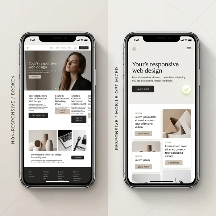
At its core, responsive design is the practice of building a site so its layout, images, and functionality adjust automatically based on whatever screen it's being viewed on — no separate mobile site, no awkward zooming, no horizontal scrolling to read a sentence. A handful of techniques make this possible: flexible grids that resize proportionally instead of relying on fixed pixel widths, images and media that scale cleanly rather than overflowing their container, media queries that apply different styling rules depending on screen size, and a mobile-first mindset that designs for the smallest screen first and builds outward from there.
The goal underneath all of it is simple: whoever's looking at the site — on a laptop, a tablet, or a phone balanced on one hand — should get a version that actually works for them, not a compromise.
Why This Still Matters as Much as It Does
Mobile Traffic Isn't a Trend Anymore — It's the Baseline
Well over half of all web traffic today comes from mobile devices, and for a lot of industries that number is much higher. A site that isn't genuinely responsive isn't losing a minority of visitors anymore — it's losing the majority. That's not a marketing statistic to quote in a pitch deck; it's the actual audience showing up at the door.
Search Engines Reward It
Google and the other major search engines have made mobile-friendliness a real ranking factor, not an afterthought. Responsive sites tend to load faster, keep visitors around longer instead of bouncing immediately, and generally perform better across the engagement signals search engines actually track. If SEO is a priority — and it should be — it's worth reading how website design and SEO actually work together before assuming responsiveness alone will carry the weight.
It Shapes the Whole Experience
People expect a site to just work, regardless of the device in their hand — easy navigation, readable text without pinching, pages that load without a noticeable delay. Responsive design is what makes that consistency possible, and inconsistency is exactly the kind of thing that quietly drives people away without them ever telling you why. This overlaps heavily with how design choices shape user experience and engagement more broadly — responsiveness is one piece of a much larger picture.
The Core Principles Worth Actually Understanding
A few practices form the real foundation of responsive design, and skipping any of them tends to show up as a problem later. Flexible grid layouts use relative units — percentages rather than fixed pixels — so the structure of a page bends instead of breaking as screen size changes. Fluid images and media scale proportionally rather than spilling outside their containers or getting awkwardly cropped. Media queries let you apply different CSS rules depending on the device, so a layout that makes sense on a wide monitor can rearrange itself sensibly on a narrow screen. A mobile-first approach flips the usual order — designing for the smallest, most constrained screen first, then adding complexity for larger ones, rather than trying to shrink a desktop design down and hoping it still works. And touch-friendly interface design means buttons and navigation elements are sized and spaced for a finger, not a mouse cursor.
The Tools That Make This Practical
Building responsive sites from scratch, by hand, for every project isn't realistic for most businesses — which is exactly why tooling exists. CSS frameworks like Bootstrap and Tailwind handle a lot of the responsive heavy lifting out of the box. Modern layout systems like CSS Grid and Flexbox make flexible, adaptive structures far easier to build than they were a decade ago. Techniques like the `srcset` attribute and the `picture` element let images serve the right size file for the right device instead of forcing a phone to download a desktop-sized image. And testing tools — Google's Mobile-Friendly Test, BrowserStack, and similar services — let you actually verify a site behaves the way it's supposed to across real devices rather than just assuming it does. For a lot of small businesses, though, the more practical route is simply choosing a website builder built with responsiveness handled by default, rather than assembling all of this manually.
How Responsiveness and SEO Actually Connect
The SEO benefits of responsive design go a bit deeper than "Google likes mobile-friendly sites." A single responsive URL for every device avoids the duplicate-content headaches that come from running separate mobile and desktop versions of a site. It improves crawlability, since search engines only need to index one version of each page instead of untangling two. It directly supports mobile page speed, which is itself a ranking factor. And it tends to improve engagement metrics like time on page, simply because visitors aren't fighting the layout to read what's in front of them. Search engines consistently reward sites that are fast, mobile-optimized, and genuinely easy to use — and penalize, in effect, the ones that aren't.
Best Practices Worth Prioritizing Right Now
A few habits separate sites that handle responsiveness well from ones that just technically pass a mobile-friendly test. Page speed and a genuinely lightweight build matter more than almost anything else — a responsive layout that takes six seconds to load has only solved half the problem. Scalable vector graphics load faster and stay crisp at any size, which makes them a better default than raster images for icons and simple illustrations. Typography and spacing deserve real attention, since text that's technically responsive but cramped or poorly sized is still hard to read. Progressive web app features can meaningfully improve the mobile experience for sites that lean on them. And testing across an actual range of devices and browsers — not just resizing a browser window on a laptop — catches problems that would otherwise only surface once real visitors hit them.

The Mistakes That Undo All of This
Even teams that understand responsive design in theory sometimes trip over the same handful of mistakes in practice. Building and maintaining separate mobile and desktop versions of a site instead of one properly responsive version tends to create duplicate-content problems and doubles the maintenance work for no real benefit. Ignoring slower network connections and lower-end devices means a site might look fine on a flagship phone with fast wifi and fall apart for a meaningful chunk of actual visitors. Using fixed-width layouts or images undermines the whole point of responsive design from the start. And overloading pages with heavy scripts or oversized media quietly drags down performance even when the layout itself is technically responsive. Every one of these is avoidable, and avoiding them tends to be far cheaper than fixing them after the fact — a pattern covered in more depth in this breakdown of design mistakes that quietly kill conversion rates.
Where Responsive Design Is Headed Next
Responsive design in 2026 isn't standing still. AI-driven adaptive layouts are starting to personalize the experience beyond just screen size, adjusting to how a specific visitor actually uses a site. Voice and gesture navigation are becoming real considerations rather than novelties. AR and VR integration is opening up genuinely interactive interfaces for the sites that need them. And dynamic content loading continues to push both speed and engagement further than static pages ever could. None of this replaces the fundamentals — it builds on top of them. For a broader look at where the industry is heading, it's worth reading through these modern web design trends shaping the digital world in 2026.
Why This Is Worth the Investment
Responsive design isn't a nice-to-have anymore — it's close to table stakes for having any real presence online. It improves the experience for actual users, supports better search rankings, and tends to show up directly in conversion numbers once it's done properly. Businesses that treat it as optional aren't just risking a slightly dated-looking site; they're risking real traffic, real revenue, and the credibility that comes from looking like a business worth trusting. That connection between a well-built website and the numbers a business actually cares about is explored further in this look at how much a website genuinely impacts sales.
Getting Started
None of this requires reinventing anything from scratch. Flexible layouts, a mobile-first mindset, and properly scaled media are well-understood practices at this point — the challenge is usually consistency, not knowledge. If you're building or rebuilding with responsiveness as a genuine priority rather than an afterthought, it's worth comparing what's actually included at each tier on Webruno's plans page before deciding where to start.