

Designing a Homepage for Online Stores
Give a visitor about five seconds. That's roughly how long most people take to decide whether an online store feels trustworthy enough to keep browsing or forgettable enough to close the tab. The homepage carries almost the entire weight of that decision — it's the digital equivalent of a storefront window, and it either pulls someone in or quietly loses them before they've even seen a single product.
A surprising number of stores get everything else right — decent products, fair prices, reasonable shipping — and still underperform simply because the homepage doesn't do its one job well. This guide walks through what actually makes a homepage work, not as a checklist to tick off, but as a set of decisions that genuinely affect whether someone sticks around.
Why the Homepage Carries So Much Weight
It's easy to underestimate how much is riding on a single page. The homepage is usually the first real impression a visitor forms of a brand, and first impressions in ecommerce are unforgiving — there's no salesperson to smooth things over, no physical storefront to lend a sense of legitimacy. Everything the visitor knows about the business, in that first moment, comes from what's on the screen.
When it works, the effects show up across the board: people trust the store more, they're more likely to actually complete a purchase once they start browsing, they stick around longer instead of bouncing after one page, and — less obviously but just as real — a well-structured homepage tends to perform better in search results too, since search engines reward exactly the kind of clarity and speed that also happens to make visitors comfortable.
Keep It Simple, Even When It's Tempting Not To
There's a strong pull, especially early on, to showcase everything a store has to offer right on the homepage — every category, every promotion, every seasonal banner. The instinct is understandable, but it almost always backfires. A homepage trying to say everything at once usually ends up saying nothing clearly, and a visitor faced with too many competing elements tends to disengage rather than dig in.
The stronger approach is restraint: a handful of clear entry points, generous white space, and a visual hierarchy that makes it obvious what matters most. Cutting things down doesn't mean the store has less to offer — it means the homepage is doing its actual job, which is orientation, not an inventory dump.
Give Special Offers Room to Breathe
A well-placed offers section does real work — a limited-time discount or a bestseller callout creates a small sense of urgency that nudges a visitor toward exploring further instead of drifting away. The trick is placement and restraint. One clear offer section, positioned where it's noticed but not competing with everything else on the page, tends to outperform five scattered promotional banners fighting for the same attention.
The Hero Section Sets the Tone Before a Word Is Read
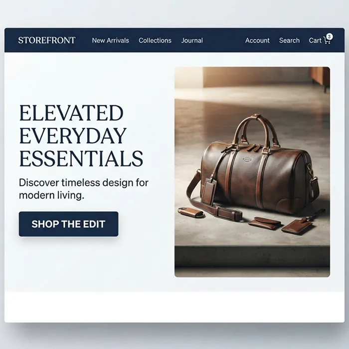
The area right at the top of the page — the hero section — is doing more work than most store owners give it credit for. It's usually the first thing a visitor's eyes land on, and it needs to communicate, almost instantly, what the business actually sells and why it's worth a second look. A strong image, a clear one-line message, and a brand tone that feels intentional rather than generic all matter here far more than clever copy or elaborate animation.
Navigation That Doesn't Make People Think
Good navigation is the kind of thing nobody notices, which is exactly the point. The moment a visitor has to pause and figure out where a category might be hiding, friction has entered the experience, and friction is what turns interested browsers into people who quietly leave. Menu labels should match how customers actually describe what they're looking for, not internal terminology that makes sense only to the business. A simple, well-organized menu structure will almost always outperform an elaborate one trying to showcase every subcategory at once.
Search That Actually Understands What People Type
A meaningful share of visitors skip browsing altogether and go straight to the search bar, especially if they already have something specific in mind. A search function that handles typos gracefully, offers autocomplete suggestions, and returns genuinely relevant results can quietly become one of the highest-converting features on the entire site — while a search bar that returns nothing useful sends exactly the kind of ready-to-buy visitor away empty-handed.
Trust Signals Do Quiet, Unglamorous Work
Nobody hands over payment details to a store that feels the slightest bit uncertain. Real customer reviews, visible security badges, clear contact information, and product ratings all chip away at that hesitation, one small signal at a time. None of these elements is flashy, and none of them alone closes a sale — but together, their absence is often what quietly explains why a visitor who seemed interested never actually checked out.
Design for Mobile First, Not as an Afterthought
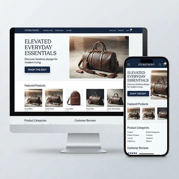
For most online stores today, more visitors arrive on a phone than a desktop, which means "mobile-friendly" isn't really an optional feature anymore — it's the primary experience for a large share of the audience. The homepage, along with everything else on the site, needs to hold up on a small screen: tap targets big enough to hit accurately, text that doesn't require zooming, and images that load quickly even on a slower connection. For a deeper look at what this actually requires beyond the basics, this complete guide to responsive web design covers the technical side in more depth than a surface-level checklist ever could.
Speed Is a Design Decision, Not Just a Technical One
A homepage that looks great but takes several seconds to load is fighting itself. Visitors don't wait around to admire good design — a slow first impression often means there's no second chance to make a better one. Compressed images, a reasonably lightweight theme, and a hosting setup that doesn't buckle under normal traffic all matter more to the visitor's actual experience than most cosmetic tweaks ever will.
Building the Homepage With Search Engines in Mind Too
A homepage that only speaks to human visitors is missing half its audience. Clean heading structure, sensible page structure, and content that actually says something meaningful — rather than vague marketing filler — help search engines understand what a store sells and who it's for. This overlap between good design and good SEO isn't a coincidence; the same clarity that helps a visitor understand a page quickly is usually exactly what helps a search engine rank it well. It's worth reading through how professional web design choices tend to improve search rankings if this connection isn't something the current homepage has been built around.
A Call to Action That Actually Asks for Something
It's surprisingly common for a homepage to look polished and still lack a single clear next step. Every homepage needs at least one obvious action it wants the visitor to take — shop a category, view a bestseller, sign up for something — expressed through a button that's visually distinct, worded clearly, and placed somewhere a visitor will actually see it without hunting. A homepage that never asks for anything rarely gets anything in return.
A Reasonable Structure to Build Around
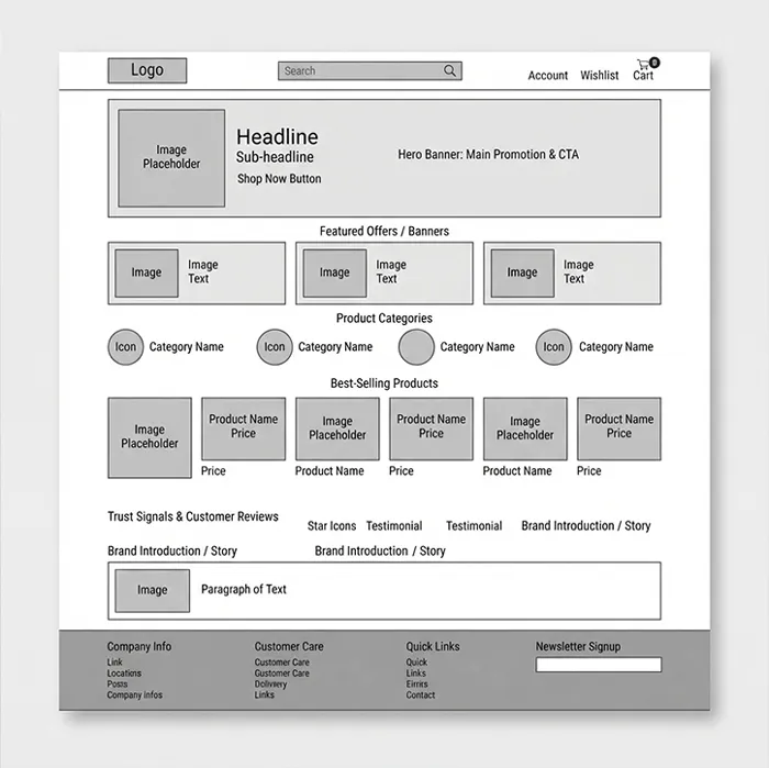
There's no single correct layout, but most homepages that perform well share a similar backbone: a header with the logo, search, and cart clearly visible; a hero section introducing the brand; a focused offers or featured section; a handful of product categories people can jump straight into; a trust section with reviews or credentials; maybe a short content section introducing the brand or linking to a blog; and a footer that actually helps, with real contact details and useful links rather than just legal boilerplate.
Designing With the Whole Experience in Mind, Not Just the Look
Good homepage design isn't really about how the page looks in isolation — it's about how quickly and comfortably someone can get from landing on the page to finding what they came for. That means trimming unnecessary steps, keeping the path to a product short, and making sure buttons and clickable elements are obvious rather than something a visitor has to hunt for. Every extra step between a visitor's intent and the action they're trying to take is a small opportunity for them to lose interest and leave instead.
Mistakes Worth Catching Before They Cost You Sales
A handful of avoidable mistakes show up again and again across underperforming homepages: cramming in too many banners at once, using low-resolution or stock-looking images that undercut credibility, having no clear direction for what a visitor should do next, skipping trust elements entirely, and treating the mobile version as a lesser afterthought rather than an equal priority. None of these individually sinks a store, but they add up quickly, and they're exactly the kind of issue covered in more depth in this breakdown of design mistakes that quietly kill conversion rates — worth a look if traffic seems healthy but sales don't reflect it.
Learning From What Already Works
It's worth studying homepages from stores that are clearly doing well, not to copy them outright, but to notice the patterns that keep showing up: restraint in how much is shown at once, a hero section that communicates in seconds rather than paragraphs, and a checkout path that never feels like a maze. A broader collection of proven approaches, like these ten practical ecommerce design tips, is a useful place to cross-check a homepage against habits that consistently perform well across different kinds of stores.
Building It Without Needing a Development Team
None of this requires deep technical skill to actually implement. Modern website builders have made it realistic for a business owner with no coding background to put together a homepage that follows all of the principles above, using templates already structured around good practice rather than starting from a blank page. Webruno's website builder is built with exactly this kind of store in mind — ready-made, responsive templates, built-in SEO structure, and a straightforward setup process that doesn't require hiring anyone to get a professional-looking homepage live. If SEO specifically is a concern going in, it's also worth understanding how a site builder and SEO actually work together before assuming a template-based approach means giving up on search visibility.
A Quick Checklist Before Calling It Done
Before treating a homepage as finished, it's worth running through the basics one more time: is the branding clear at a glance, is there a hero section with an obvious message, is there at least one clear call to action, does the mobile version actually work well rather than just technically render, does the page load quickly, are reviews or trust signals visible, is the structure sensible for both visitors and search engines, and does the footer actually help rather than just fill space. Most homepages that underperform are missing two or three of these, not all of them — which is usually good news, since it means the fix is often smaller than it seems.
Bringing It All Together
The homepage isn't just another page on a store — it's the single place carrying the most weight in deciding whether a visitor becomes a customer or simply moves on. Get the fundamentals right — clarity, speed, trust, and a clear next step — and the rest of the store gets a real chance to do its job. For anyone building or rebuilding a store with all of this in mind from the start rather than patching it together later, it's worth seeing what Webruno's plans actually include before deciding how to approach the build.