

eCommerce Web Design: Best Practices for Online Stores
Open ten online stores in a row and you'll notice something strange: most of them look fine. Clean layouts, decent photos, a logo in the top left where it's supposed to be. And yet only a handful of them actually sell well. The gap between a store that looks professional and a store that converts visitors into paying customers is almost never about aesthetics alone — it's about a hundred small decisions made (or not made) along the way, most of which a casual visitor would never consciously notice but would absolutely feel.
This is a long guide, because ecommerce design genuinely has a lot of moving parts, and shortcuts here tend to cost more than they save. If you're building a store from scratch, redesigning an underperforming one, or just trying to understand why your bounce rate refuses to budge, this covers the practices that actually move the needle — not the generic "use white space" advice that shows up everywhere, but the specific things that separate stores people buy from and stores people quietly leave.
Why Ecommerce Design Is a Different Discipline Than Regular Web Design
It's tempting to treat an online store like any other website with a shopping cart bolted on. That mindset is exactly why so many stores underperform. A regular website's job is usually to inform or persuade someone to take one action — fill out a form, make a call, send an email. An ecommerce site has to do something much harder: guide someone through a multi-step decision involving money, trust, and often comparison against several competitors, all while that person is one impatient click away from leaving forever.
Every page on a store carries weight that a typical brochure site doesn't. A product page isn't just displaying information — it's replacing the in-person experience of picking something up, turning it over, and deciding whether it's worth the price. A checkout page isn't just collecting a payment — it's the single moment where hesitation costs you the most money you'll ever lose to a design flaw. Understanding that shift in stakes is really the starting point for everything else in this guide.
Start With the Homepage, But Don't Overthink It
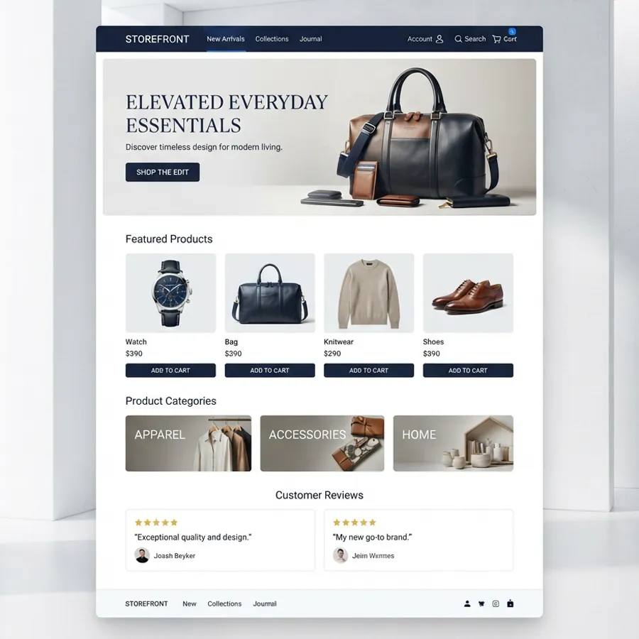
The homepage gets more design attention than almost any other page on a store, which is a little ironic considering how few visitors actually convert directly from it. Its real job is orientation — telling a new visitor what kind of store this is, what they sell, and why they should trust it, all within a few seconds before that visitor either scrolls or bounces.
The stores that get this right tend to keep the homepage relatively restrained: a clear value proposition near the top, a handful of strong product categories or bestsellers, some kind of trust signal (reviews, press mentions, a guarantee), and a clean path into the catalog. The stores that get it wrong usually make one of two mistakes — either they cram every promotion, banner, and announcement onto a single page until nothing stands out, or they go so minimal that a visitor genuinely can't tell what's being sold. If homepage layout feels like the part you keep second-guessing, it's worth looking closely at how a homepage should actually be structured for an online store before making further changes, since small structural fixes here tend to compound across every other page.
Navigation: The Part Nobody Notices Until It's Broken
Good navigation is invisible. Bad navigation is the reason someone gives up on finding a product that was three clicks away the whole time. This is one of those areas where ecommerce differs sharply from other kinds of sites — a blog can get away with a simple top menu, but a store with a real catalog needs a navigation system that scales.
A few things matter more than people expect here. Category names should match how customers actually think and search, not internal business jargon. A mega-menu, if you use one, should never force someone to hunt through six unlabeled columns to find what they want. Search should be prominent and forgiving of typos, since a meaningful share of visitors will use it the moment they can't immediately spot what they're after in the menu. And breadcrumbs, while small and easy to dismiss as a minor detail, quietly reduce the number of people who land on a product page and have no idea how to get back to the category they came from.
Product Pages: Where the Actual Selling Happens
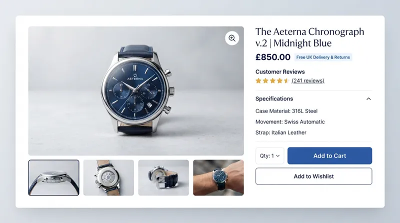
If the homepage is the storefront window, the product page is the moment someone picks the item up and turns it over in their hands. This is where design decisions have the most direct, measurable effect on whether someone buys.
Photography and Visual Presentation
People can't touch a product online, so the images have to do that job instead. Multiple angles, a zoom function that actually works, and — where relevant — a way to see the product in context or in use, all reduce the uncertainty that makes people hesitate. A single low-resolution photo on a white background is the fastest way to make even a genuinely good product look cheap or untrustworthy.
Descriptions That Answer the Actual Question
Product descriptions get written for two very different audiences at once: the person deciding whether to buy, and the search engine deciding whether to rank the page. The mistake is writing purely for one and ignoring the other. A description that's just a wall of generic marketing language ("premium quality, built to last") answers nobody's real question. For a broader checklist beyond just photos and copy, this collection of proven ecommerce design tips covers the rest of the product page in more detail. A description that leads with the specific details a buyer actually needs — materials, dimensions, what's included, how it compares to similar options — tends to convert noticeably better, while also giving search engines something more substantial to index.
Reviews and Social Proof
Very few people buy something online with zero external validation, especially from a store they haven't purchased from before. Reviews, ratings, and even simple things like a photo submitted by a previous buyer do a lot of quiet, unglamorous work in reducing hesitation. Stores that hide or bury this kind of proof are usually leaving real money on the table.
Category Pages: The Overlooked Middle Step
Product pages get most of the design attention, and homepages get most of the strategic attention, which leaves category pages sitting in an odd middle ground that a lot of stores design almost by accident. That's a shame, because category pages are frequently where a visitor spends the most time actually comparing options before committing to a single product.
A category page that works well does a few things at once. It shows enough product information at a glance — image, price, maybe a rating — that a visitor can compare several items without clicking into each one individually. It sorts and filters intelligently, so someone looking for something under a certain price point or in a specific size isn't forced to scroll through everything else first. And it avoids the trap of either showing too little (forcing extra clicks just to get basic information) or too much (turning the page into visual clutter that makes comparison harder rather than easier).
Pagination versus infinite scroll is worth a deliberate decision here rather than a default setting left unchanged. Infinite scroll can feel smoother for casual browsing, but it makes it much harder for someone to return to a specific spot in the results, and it can quietly hurt SEO if not implemented carefully. Traditional pagination, done well, actually tends to serve serious comparison shopping better than people assume, even if it feels slightly old-fashioned by modern interface standards.
The Mobile Experience Isn't Optional — It's Often the Majority
For most online stores today, more people arrive on a phone than a desktop, which makes "mobile-friendly" an outdated way to describe the goal. The real target is a mobile experience that's just as fast and frictionless as desktop, not a scaled-down, compromised version of it. Buttons need to be big enough to tap accurately, forms need to work with on-screen keyboards without becoming a nightmare, and images need to load quickly on a mobile connection that isn't always great.
This is also where responsive design earns its reputation as one of the least optional parts of modern ecommerce. A layout that looks perfect on a widescreen monitor but breaks or requires constant pinch-zooming on a phone isn't a minor inconvenience — it's actively costing sales, often silently, since most people who hit a broken mobile page simply leave rather than complain. If mobile performance hasn't had dedicated attention recently, a proper walkthrough of responsive web design fundamentals is worth revisiting, since the standards here shift more often than most store owners assume.
Site Speed: The Practice Everyone Agrees On and Almost Nobody Prioritizes
Ask any ecommerce owner if speed matters and they'll say yes without hesitation. Ask them when they last actually tested their store's load time and the answer gets a lot vaguer. Speed is one of those areas where the gap between knowing something matters and actually acting on it tends to be enormous.
Every extra second of load time increases the odds someone leaves before the page even finishes rendering, and that effect compounds on mobile connections where bandwidth is less forgiving. Large, unoptimized images are usually the single biggest culprit, followed closely by bloated themes carrying scripts and features a store doesn't actually use. None of this requires a total rebuild to fix — compressing images, trimming unused plugins or scripts, and choosing a platform that handles performance well by default usually recovers most of the lost speed without a developer needing to touch a line of custom code.
Checkout: Where Good Design Turns Into Actual Revenue
Checkout is the single highest-stakes page on any store, and it's also, frustratingly, one of the most commonly neglected. A visitor who's made it this far has already decided to buy — the only remaining question is whether the process itself gives them a reason to change their mind.
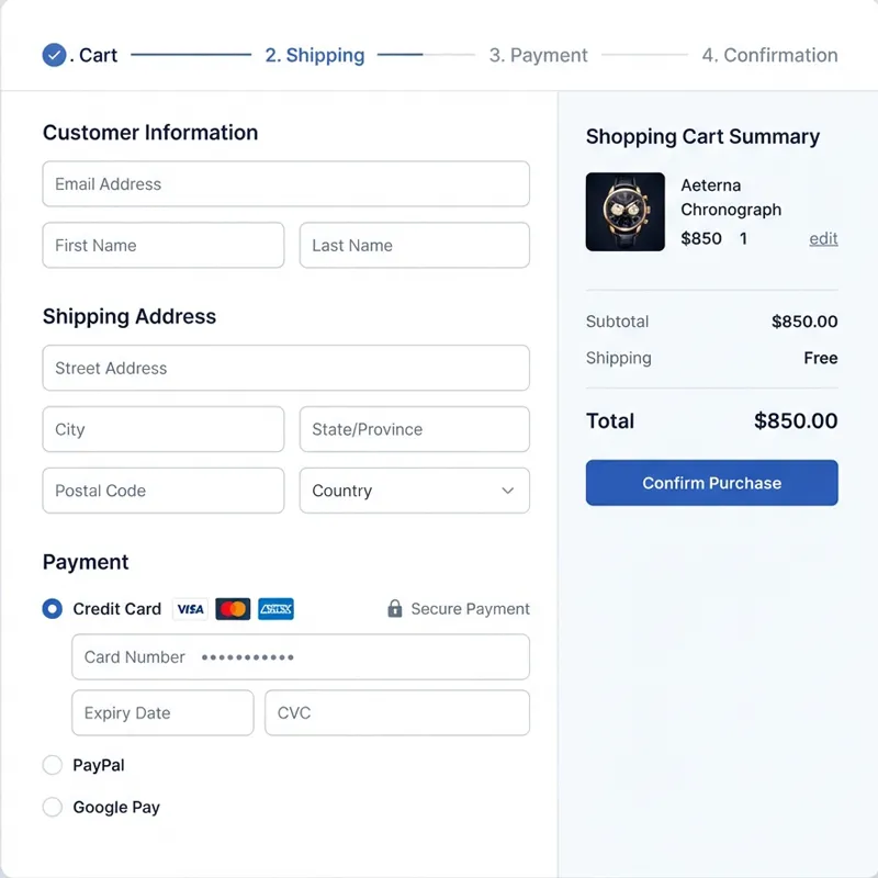
Cart abandonment is rarely about the price alone. Unexpected costs revealed only at the final step, a checkout that forces account creation before purchase, a form with more fields than necessary, or a payment section that feels untrustworthy — any one of these is enough to make someone close the tab. This is exactly why properly connecting a payment gateway to your online store deserves more attention than it usually gets; a checkout that feels secure, familiar, and fast is doing more to protect revenue than almost any other single design decision on the site.
A few practices consistently reduce friction here: showing the total cost, including shipping, as early as possible rather than saving it for a surprise reveal; offering guest checkout as a genuine option rather than a buried afterthought; supporting the payment methods customers already trust and use elsewhere; and keeping the number of steps to an absolute minimum. Every additional click or field is another moment where someone can talk themselves out of the purchase.
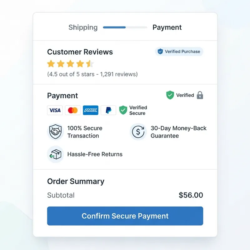
A progress indicator during multi-step checkout also does more quiet work than most stores give it credit for. Knowing there are two steps left rather than an unknown number left keeps people moving forward instead of wondering how much longer this is going to take. Small psychological details like this rarely show up in a design brief, but they consistently show up in conversion numbers once tested against a version without them.
Trust Signals: The Quiet Work of Convincing Strangers to Pay You
Buying from an unfamiliar online store requires a small leap of faith, and design either supports that leap or undermines it. Security badges near the payment section, a clearly stated and easy-to-find return policy, real contact information rather than a bare contact form, and consistent, professional branding throughout the site all contribute to a sense that this is a legitimate business rather than a storefront thrown together overnight.
None of these elements individually makes or breaks a sale. Together, though, they build the kind of quiet credibility that makes someone comfortable entering their card details — and their absence, even if a visitor can't articulate exactly why, tends to register as a reason for hesitation.
Search and Filtering: Helping People Find What They Already Want to Buy
A store with a large catalog lives or dies on how easily people can narrow it down. Filtering by price, size, color, category, or whatever attributes actually matter for the product line isn't a nice-to-have feature — it's often the difference between a visitor finding the right product in thirty seconds and giving up after two minutes of scrolling through irrelevant results.
On-site search deserves particular attention here, since it tends to attract visitors who already have strong purchase intent — they know roughly what they want and are actively looking for it. A search function that returns poor or irrelevant results is turning away some of the most valuable, ready-to-buy traffic a store gets. Autocomplete suggestions, typo tolerance, and sensible result ranking all pay for themselves quickly in a catalog of any real size.
Visual Design and Branding: Consistency Beats Cleverness
It's easy to assume good ecommerce design means bold, distinctive visuals that stand out from competitors. In practice, consistency usually matters more than cleverness. A cohesive color palette, a readable font pairing used consistently across every page, and a visual style that matches what's actually being sold all quietly build trust in a way that flashy but inconsistent design doesn't.
This is also where it's worth being honest about how design choices affect the overall experience a visitor walks away with — not just whether a page looks nice in isolation, but whether the whole site feels coherent and intentional from the homepage through to the order confirmation. A store that looks like five different people designed five different pages, even if each page individually looks fine, creates a subtle sense of unease that undermines everything else done right.
Common Mistakes That Quietly Undercut Good Design Elsewhere
Even stores that get the big things right often lose sales to smaller, easily overlooked mistakes. Pop-ups that appear before a visitor has had a chance to see anything. Auto-playing videos or sound. Text with too little contrast against its background, making product details genuinely hard to read. Forms that reset or lose data when a validation error occurs, forcing someone to re-enter everything. None of these individually sinks a store, but they add up, and they're exactly the kind of thing covered in more depth in this rundown of design mistakes that quietly kill conversion rates — worth a read if a store's traffic looks healthy but sales don't match it.
Building for SEO From the Start, Not as an Afterthought
A beautifully designed store that nobody finds isn't actually solving the business problem it exists to solve. SEO and design aren't separate disciplines that get handed off to different people at different stages — they're deeply intertwined, especially for ecommerce, where category and product pages are often the primary way people discover a store in the first place.
Clean URL structures, properly used heading tags, fast load times, and genuinely useful product descriptions all serve both the visitor and the search engine simultaneously. Image alt text, often treated as a checkbox exercise, actually does double duty — improving accessibility for visitors using screen readers while giving search engines more context about what's being sold. None of this needs to come at the expense of good visual design; the two goals overlap far more than most store owners assume once the technical basics are handled properly from the beginning rather than patched on after launch.
Accessibility Isn't a Niche Concern
Accessible design is sometimes treated as a specialized add-on rather than a core part of good ecommerce practice, which is a mistake on both ethical and purely commercial grounds. Sufficient color contrast, keyboard-navigable menus, properly labeled form fields, and alt text on product images make a store usable for a meaningfully larger share of potential customers — including plenty of people who don't identify as having any particular accessibility need but still benefit from clearer, higher-contrast, more navigable pages.
Most of these practices, once built in from the start, add very little friction to the design process. Retrofitting them after launch tends to be far more expensive and disruptive than including them from day one.
Testing, Not Guessing
Even well-researched design decisions are still, ultimately, informed guesses until real visitors interact with the page. A/B testing checkout flows, product page layouts, and even something as small as button color and copy consistently reveals things that intuition alone misses. What works for one store's audience doesn't automatically transfer to another's, which is exactly why ongoing testing tends to outperform a one-time redesign that never gets revisited.
Heatmaps and session recordings are particularly useful here, since they show, often uncomfortably clearly, where visitors get confused, where they hover without clicking, and where they abandon a process midway through. A store that treats design as a finished project rather than an ongoing process tends to plateau; one that keeps testing tends to keep improving.
Personalization, Used Carefully
Recommending related products, remembering a returning visitor's browsing history, and tailoring homepage content based on past behavior can genuinely lift conversion rates when done well. The caveat is that personalization done poorly — recommendations that feel random, or worse, tracking that feels invasive rather than helpful — actively damages trust instead of building it. The goal is relevance that feels like good service, not surveillance that feels uncomfortable.
A useful test here is whether a recommendation would make sense to explain out loud to the customer. "You looked at running shoes, so here are some socks that pair with them" is the kind of relevance that feels helpful. Recommendations that feel arbitrary or oddly specific tend to unsettle people rather than nudge them toward another purchase, even when the underlying logic technically made sense to whatever algorithm generated it.
What Happens After the Purchase Still Counts as Design
It's easy to think of ecommerce design as ending the moment someone clicks "buy," but the order confirmation page, the follow-up email, and the overall post-purchase experience are still very much part of the design surface — and they get far less attention than they deserve. A confirmation page that clearly states what happens next, roughly when the order will arrive, and how to get in touch if something goes wrong does real work in reducing the anxious "did that actually go through?" feeling that follows any online purchase.
This matters more than it might seem, because a first-time buyer's experience after checkout heavily influences whether they come back. A store that goes quiet the moment payment clears, leaving someone to wonder whether their order is being processed at all, is quietly undermining the trust it worked hard to build during the shopping experience itself. Good design doesn't stop at the transaction — it carries through to the point where the product is actually in the customer's hands.
Bringing It All Together
None of the practices above work in isolation, which is really the core lesson underneath all of this. A fast site with a confusing checkout still loses sales. A beautifully photographed product page on a store that takes eight seconds to load still loses visitors before they ever see it. Good ecommerce design is less about any single brilliant decision and more about the absence of unnecessary friction at every single step between someone arriving on the site and completing a purchase.
If there's one habit worth adopting above all the specific tactics in this guide, it's treating the store as something to keep refining rather than something to finish once and leave alone. Design decisions that felt right at launch can quietly stop working as the catalog grows, as traffic sources shift, or as customer expectations move in ways nobody explicitly announces. Customer behavior shifts, devices change, competitors improve, and a store that was well-designed two years ago can quietly fall behind without a single visible sign that anything's wrong — until the sales numbers start telling the story on their own. For businesses looking to build or rebuild with all of this handled from the ground up rather than patched together piece by piece, it's worth seeing what a platform designed around these exact fundamentals actually looks like before starting from scratch.